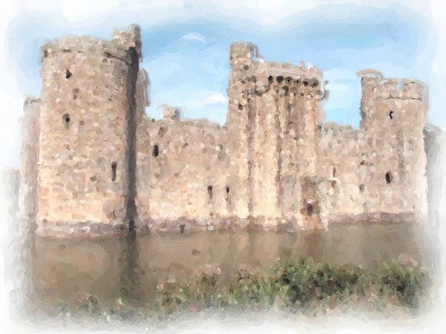
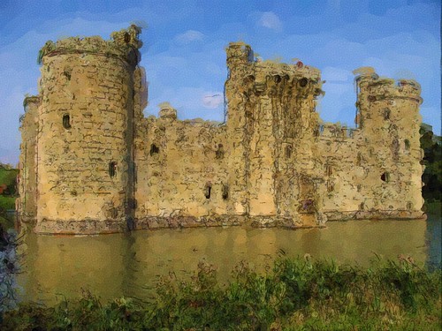
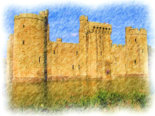
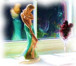
As promised, here are some more painting styles using the same photograph as yesterday. I would be interested to know which of all of them you like best.
Random thoughts and photos of my journey through life…
As promised, here are some more painting styles using the same photograph as yesterday. I would be interested to know which of all of them you like best.
14 Comments CherryPie on Aug 11th 2009


I know what you did up top. Middle one please.
They are all created with the same program using the default settings. The middle image is a water colour sketch, which produces the harsh lines around the image. It is also a lot more vivid than a true water colour.
Modern technology!
I think both of us would struggle to be without our digital cameras
I love those effects
Glad you enjoyed them
I like the water of the second one,but of the castle, not sure; the first has the impressionism look, but overall, I like the colours in the second one.
I think my favorite of all of them is the black and white one from the previous post
The first one for me please…as GirlFriday says, it has the
impressionist feel to it.
That one does make for a rather interesting effect
Top one for me, please, Cherie. The middle one’s neither one thing nor t’other (colours postcard bright; pencil/ink lines too harsh against background), and the last one’s a bit too tidied-up.
Nice to see Bodiam again, though!
At full size those lines look even worse. I think my favourite of them all is the black and white one in the first post
It’s fun playing with art programs and fixing a photo that may not quite make it on it’s own. These are great effects Cherie, each holding its own in the right circumstance. Well done.
I am glad you like them I agree art programs are good for making the best of a photo that I am not entirely happy with. I also like trying them out on some photo self portraits that I have done.