I found the Salisbury Font fascinating and breathtaking:
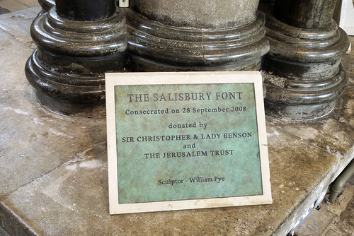
The Salisbury font was designed by the renowned British water sculptor William Pye. It was installed in September 2008 and dedicated by the Archbishop of Canterbury during the celebration of the 750th anniversary of the consecration of the Cathedral.
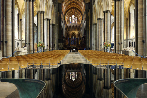
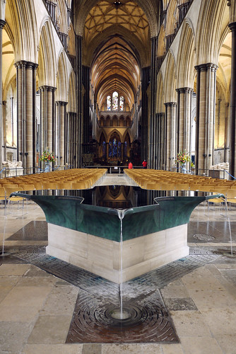
Cruciform in shape, the font has a 3-metre span to allow total immersion baptism. It is a green patinated bronze vessel with a Purbeck Freestone plinth and brown patinated bronze grating. Water is the predominant feature, and here two contrasting aspects of water are woven seamlessly together. There is stillness expressed in the smooth surface which reflects and extends the surrounding architecture, while the flow and movement of water passing through spouts at each of the four corners and disappearing through a bronze grating set into the floor expresses its essential life giving properties.


i find this whole presentation fascinating and breathtaking Cherrie… what a wonderful job… Bravo!!!
….peter:)
Thank you Peter
It just goes to show, old and modern can go together perfectly. I love it.
I think it works really well where it is placed.
It is indeed stunning. But does it ‘fit’ the architecture?
You were there and could get a better sense than the photo gives, but the old, traditional architecture does not always accommodate the ‘modern’.
I remember when Coventry Catherdal was ‘opened’. What a disaster it was and still is. And yet everything fitted together. Modern.
I am ambivalent about this one.
The aspects you emphasise are wonderful. The stillness and extent of the water really is something to write home about. But….. hmmmmm
When I was there what stood out was the architecture and the stained glass windows reflecting in the water. The eye is distracted away from the font itself. Photographs don’t really give an appreciation of how it looks in situ. For me it works and fits well in its setting.
Around the edge of the font are words from Isaiah – “Do not fear for I have redeemed you. I have called you by name you are mine. When you pass through the waters, I will be with you. And through the rivers they shall not overwhelm you.”
It is many years since I visited Coventry. My lasting memory is of the ruined, still beautiful remains of the old Cathedral. I was underwhelmed by the new Cathedral and for me it was cold with no atmosphere. I was left wondering why they hadn’t rebuilt it more in keeping with the old Cathedral. The new building does not work for me.
That is phenomenal!! I was in salisbury in 2000 so would not have seen this font then had the cathedral been open when I was there,but it certainly is worth making the journey to see!
Thanks for showing us!
I LOVE it!
As I said in my post, I found it breathtaking
I particularly love the symmetry in that last photo. Beautiful pictures!
The symmetry is appealing, it works.
Thank you