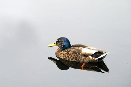
Often when reviewing photographs that I have taken I see many photographs within the original photo. When I reviewed this photo I couldn’t see any way to better my original capture. I liked it as it was! So I didn’t work on any alternative views…
It seems from my comments thread that I may have been mistaken, so I present to you some alternative cuts…

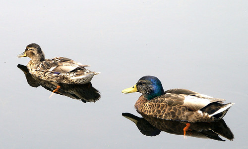
I have to confess that after the suggested alterations I saw that I had missed some of the different perspectives in my original photo. Now it has been pointed out to me I can see others too.
You will be pleased to know I have turned off Photoshop for the time being, so I won’t be tempted to add some additional variations ![]()
I do wonder which crop appeals the most and if you can see a better crop…


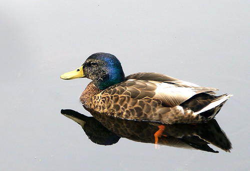
JD crop2
and
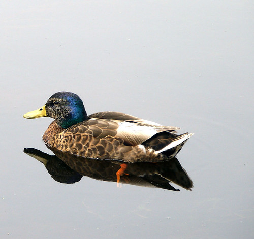
DQ crop2
although with the latter it might have been better to have the quacker lower in the frame

9/10
very good
I also like JD crop 2. That picture and the one above I had to clone out the back of the lady duck, which is why the water top left hand corner of the first photo doesn’t quite work…
That problem got me thinking the proportions would still be right if the duck was nearer to the left of the photo which resulted in JD crop 3.
And that thought led me to experimenting with the duck at the top of the photo DQ crop 2. I am not keen on it, as you say it would be better if she was lower in the frame
Of these alterations in addition to JD crop 2 I also like DQ crop 3. But of course I still like my original directors cut too
Every one a beauty but I like the final two best, and if allowed only one then the last one… but then the 2nd one is awfully good too. A great shot (and seen upside down or at 90 degrees as in an Aileen fly-by are both good too)
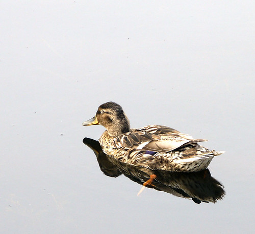
The second from the bottom really needs to be framed a little differently for me to appreiciate. She needs to be lower in the picture frame…
I would love to see a visual of Eileen’s perspective
I’d agree with JD.
Great pictures Cherie.
Thanks RD
My favorite is #2 and next favorite is #4. Well done, Cherry. It shows to go ya that there’s always more than one way of seeing something!
It seems like No two is coming out tops overall
I am with JD too…..I always like a little space in the frame in the direction that either the animal or person is looking. Lovely reflections
To get the space at the front, I had to do a bit of erasing of the back of the female duck. That is why the water in the first photo looks a little odd at the top left!
I like the detail on the second one and preferring the first to the third based on its position in the image. However seeing we have the full picture, nothing beats the story of the original.
I like 2 and 6 but but I still like the directors cut (the original) it is what I saw on the day.
Thank you for your thoughts